
David vs. Goliath
There are some things that are almost impossible to explain without a graphic or visual. With complex issues, the value of using visuals cannot be over-exaggerated.
There are many conflicting headlines in today’s housing market. A good graph or chart can go a long way to removing the doubt that these headlines create.
Here are two examples:
Connecticut Housing Market Is Coming Back!

Is the market actually recovering? Is this the time to buy before prices start to appreciate? There are some buyers that might think that you are saying these things just to make a sale.
However, the Pending Sales graph shown here (covering the last two years) proves that the market, without doubt, is recovering nicely.
Short Sales Are Banks' Priority
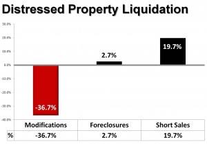 Some of you might argue this point because of bad experiences you have had in the past. However, the Office of the Comptroller of the Currency recently released their Mortgage Metrics Report. This graph showing the year-over-year changes in the three major categories of distressed property liquidation (modifications, foreclosures and short sales) shows banks are shifting their priority to short sales.
There are many issues that Dave Jones Realty discusses with our buyers and sellers. We make sure our client conversations are augmented with the necessary visuals that will enable the points we are emphasizing!